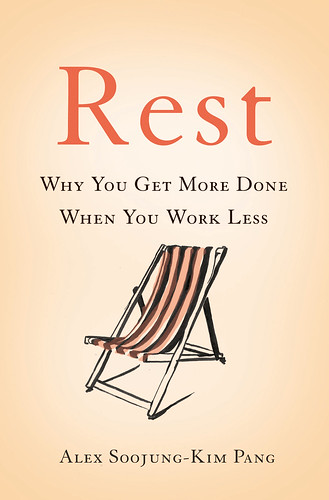
This is the cover of REST. I wasn’t involved in the design: authors usually aren’t, unless they have design backgrounds, otherwise they’re a lot more likely to mess up a cover than improve it.
I liked the cover from the beginning: it’s simple, uncluttered, and to the point.
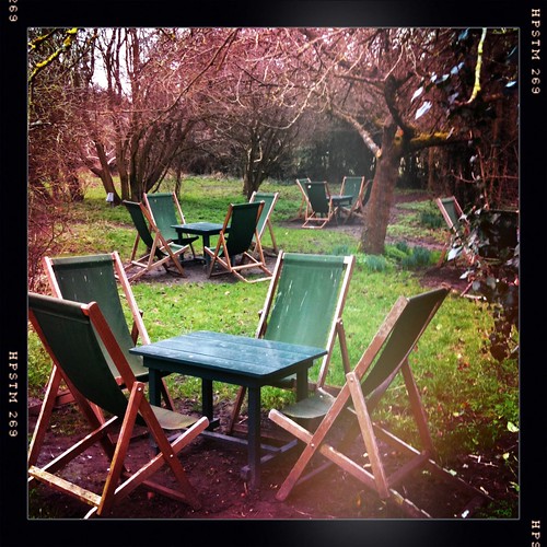
I also liked it because the chair happens to remind me of one of my favorite places: The Orchard, a tea house near Cambridge. When my wife and I were on sabbatical, we went there several times: it’s a lovely walk or ride from Cambridge to Grantchester, via a ridiculously photogenic meadow that was bought by Trinity College around the same time Copernicus was thinking about the solar system.
Once you get it adjusted properly, this kind of chair is super-comfortable, excellent for an afternoon of lounging with a good book, with a cup of tea and a scone.
I hadn’t had any contact at all with the cover artist, and I don’t know how much of the book they read before starting work. So I was especially delighted when I saw the chair on the cover or REST. I thought, clearly this is meant to be.
Finally, this year for Father’s Day, my wife and daughter found a version of the chair:
So now I can work at home in a version of the chair that’s on the cover of my book, which in turn reminds me of the place where I started thinking seriously about rest. (Not the very first place, but I prefer the chair to a terrifying clown marionette.)


