Sunday afternoon, I braved the single-digit temperature, ice on the roads, and responsibility for my dad’s beloved Honda Element to go see the Hamilton Wing of the Denver Art Museum, the new (2006) Daniel Libeskind addition.
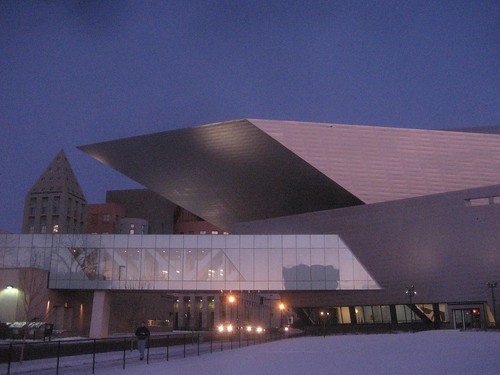
denver art museum, via flickr
Over the last few years, Denver has been building the area around DAM into a more coherent cultural complex, and trying to turn it into a Destination. The Denver Public Library is right beside the art museum; the historical society and state museum are up the block; and there’s a new performing arts complex.
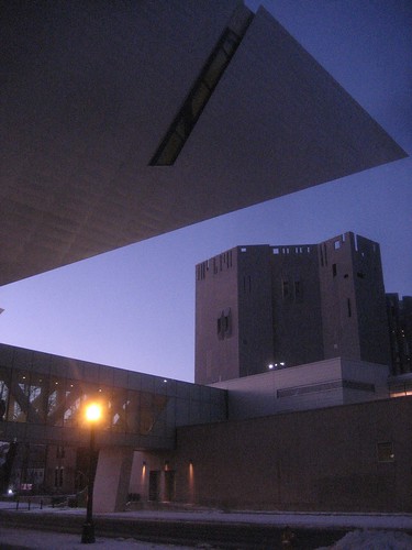
the old (now north wing), denver art museum, via flickr
The main stairway is a wonderfully dynamic space: not only is it a petting zoo of exotic angles, but as I returned to it through the afternoon, it looked different as the light changed.
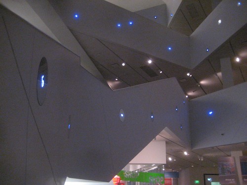
stairway, via flickr
I know people have criticized the building for being confusing and vertigo-inspiring, but I found it no harder to navigate than a more conventional, square building. Each floor has two or three galleries, and once you have a working mental model of the basic layout, you can figure out things pretty easily.
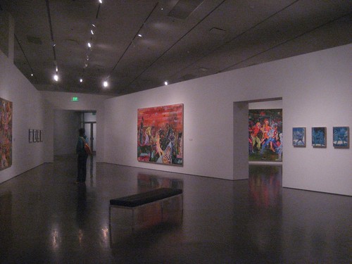
daniel richter exhibit, via flickr
In fact, the unusual shape of the building probably makes it easier to orient yourself: when you’re in a gallery that comes to a sharp point at one end, you know that the exit is in the other direction.
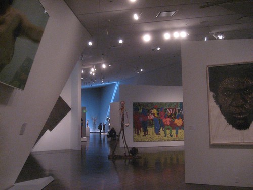
fourth floor: modern and african, via flickr
More generally, I think the shape of the galleries gives the exhibits a measure of dynamism that they wouldn’t have in a more conventional space. The Clyfford Still exhibit, for example, has a number of huge paintings– Still was arguably the first Abstract Expressionist, and he worked on the large scale characteristic of the movement– that weren’t just hung from the walls; they were suspended from the ceiling in a way that made them look like they were either floating, or had emerged from the angled wall behind them.
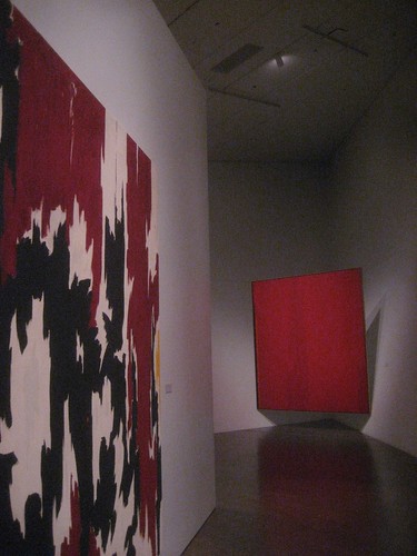
clyfford still, via flickr
And spending time in the Daniel Richter exhibit, which has a lot of tough, street-wise paintings, was definitely made more interesting by the space. I’m not sure that this would enhance the experience of looking at Dutch still-life paintings or Venetian portraits… but maybe it would.
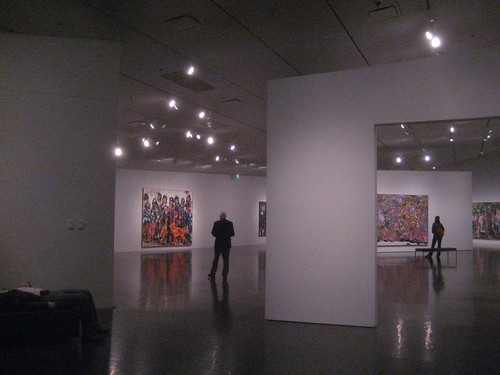
daniel richter exhibit, via flickr