I think everyone will agree that 18 hours is far too little time to really see Paris; likewise, any seasoned traveler will agree that 8 hours is more than enough time to experience Charles De Gaulle airport. Or at least that’s what I expect to conclude, after my day here.
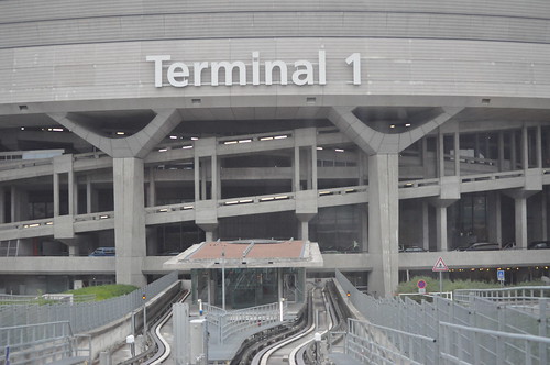
I was supposed to be on a flight home early this morning, but thanks to a problem with my ticket that’s too pedestrian to share yet sufficiently problematic to keep me from getting on the plane, I’ve got a full day here at CDG. I was going to fly out of the relatively new Terminal 2E, which is a shiny giant shed-type hall familiar to anyone who’s spent time in Singapore, Malaysia, Terminals 4 and 5 of Heathrow, the phenomenal Denver airport, or any number of other airports built in the last decade. (For those of you who don’t know, the Very Big Terminal That’s Also a Destination and a Statement is all the rage, and the new ones tend to be mind-bogglingly large open spaces.) Since I could get a flight on Continental and United for 1/4 what Air France wanted, and since Star Alliance flies out of Terminal 1, I’m here.
via flickr
For those of you who’ve never been to Terminal 1 and are of a certain age, you’ve seen it on the cover of the Alan Parsons Project’s classic album I Robot. For those who are younger, imagine the proposed donut-shaped Apple headquarters… gone terribly, terribly wrong.
via flickr
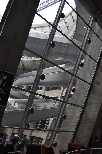
I really enjoyed myself on this trip, I have a growing number of French friends, and I find the place completely lacking the snobbishness that Americans expect (partly this is a function of moving in tech and academic circles, whose membership seems to regularly worry about having to play catch-up to the US). But Terminal 1 is one of the great, if not the greatest, acts of architectural contempt ever. It’s like foreign policy in the 2000s, or the creation of subprime mortgages designed for people who couldn’t even make the first payment. It seemed like a good idea in a certain heady, breathe-your-own-exhaust bobble, but in retrospect is so obviously a bad idea you have to wonder: didn’t anybody say something?
via flickr
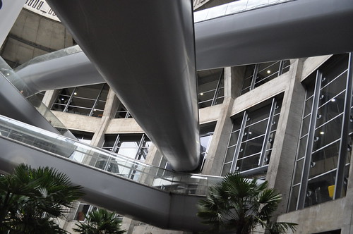
The thing that sums it all up is the central courtyard, which is enclosed by the torus-shaped building, and whose airspace is crisscrossed with people movers, like the travelators at Ikea that always seem to be out of order. It was probably meant to be a commentary on alienation and modernity, or maybe it was a way for the travelers to begin to take to the skies as soon as they headed to their gates, but– bitch, PLEASE. They’re a bunch of damn hamster tubes. I doubt anyone working today would create something that would be such a challenge to maintain, and creates such a traffic bottleneck. We still make plenty of design mistakes, but I think airport designers today would make different ones.
via flickr
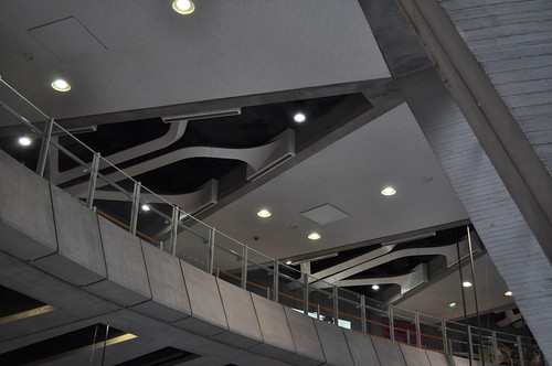
The rest of the airport feels to me like your basic 1960s modernist dream, the sort of thing that Archigram and Team X would have cried tears of joy over: it’s all roughened, sculptural concrete, primary colors, glass and metal. Some of the ceiling detailing has a wing-like filigree that suggests that Someone Was Trying, but still… it’s a whole that’s much less than the sum of its parts.
Plus a circular building feels like a mistake. It takes a big space and makes it feel eternally smaller, without hinting that there are interesting things elsewhere. And of course, expansion is impossible. You can’t build onto a building like this, you can only build new terminals in the same general time zone (the inter-terminal train system deserves high marks).
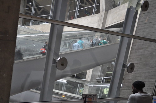
via flickr
Still, it’s better than the Dulles gates, if only because the contrast between Saarinen’s magnificent main terminal and the shocking pedestrianism of every later expansion is so painful. The other terminals don’t feel like they were even designed: they were assembled in the same Platonic architectural workshop that mindlessly turns out self-serve gas stations and downscale strip malls. At least this place was trying to make a statement, and no matter how badly they misfired or how poorly the project has aged, there was effort here.
But I found a working power outlet for my iPad, I have Diet Coke, I have 900 pictures downloading into my photo editor, and most important, I have a ticket home. So it’s cool.