So far, my discussion about the mindful iPhone has focused on things you can do to your phone to make it less distracting, better able to distinguish between important and less important communication, and more protective of your attention. But there are also things you can do to help make you more mindful when using your phone. Of course, the paradox of mindfulness is that you can’t trick yourself into doing it, nor is there a technology that makes you mindful. But there are things you can do to encourage it.
One simple one involves changing your backgrounds and lock screens. Background screens are usually treated as eye candy. But think about how many times a day you see these screens. Every one of those little interactions can be a reminder to, as it were, think differently about your phone, a nudge (as Cass Sunstein and Richard Thaler put it) to get you to your phone a bit more thoughtfully.
What's a nudge? The concept comes from Cass Sunstein and Richard Thaler's book Nudge. There, they talk about two things: choice architectures, and nudges. Choice architectures are things that organize "the context in which people make decisions". We live in worlds saturated with choice architectures: indeed, almost any object that communicates information to users and performs an action in the world – thermostats, gas price signs, credit card statements – is a choice architecture. Systems that present us with easy-to-understand choices that we act on immediately, like traffic lights and street signs, are pretty unambiguous: we understand why it is in our best interest to stop at a red light. Other choice architectures are a little more ambiguous: the effort by social media apps to always deliver push notifications, for example, clearly benefits the company, but you should think about whether it really benefits you.
Nudges are a part of choice architectures. A nudge is "any aspect of the choice architecture that alters people's behavior in a predictable way without forbidding any options or significantly changing their economic incentives". Nudges are most useful for "choices that have delayed effects; those that are difficult, infrequent and offer poor feedback; and those for which the relation between choice and experiences ambiguous". What they love about nudges is that by structuring initial choices wisely, it is possible to play on people’s flawed thinking about the future – in ways that help them reach their goals, and reach better futures. A good example is Save More Tomorrow, a retirement program developed by Thaler that is used by a number of states. With Save More Tomorrow, participants in retirement programs automatically increase their contribution levels every time they get a raise. People are terrible at examining and rebalancing their retirement portfolios (the book has a hilarious example of a Nobel laureate in economics who confesses that, even though he's done important work on financing retirement, hasn't looked at his own portfolio in ages), and increasing your contribution manually feels like you're losing money. A nudge does not try to overcome our reliance on simple rules of thumb, anchoring biases, or our aversion to risk and loss; rather, it exploits them, by setting up a good rule that we can then ignore.
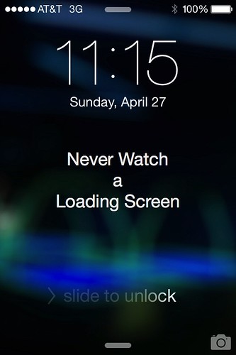
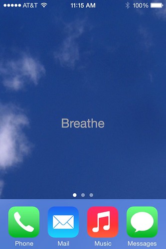
The iPhone has two screens (or "wallpaper" as they now call it) you can customize: the lock screen, and the home screen. The lock screen is the screen you see when you first bring your iPhone out of sleep mode: it shows the time, the "slide to unlock" bar, and the camera. The home screen is the screen you return to when you press the button on the bottom of the phone: the icons for your other apps are arranged on top of it.
My lock screen is a picture of a video game arcade's darkened interior, with the words "Never Watch a Loading Screen."
My home screen has a picture of the sky (outside Arizona State University's Coor Building) onto which I've added the word "Breathe."
I was inspired to make the lock screen after I noticed an acquaintance, a CalTech Ph.D. and startup founder, attentively watching her iPhone as she waited for new email to download. "Does it work if you don't watch it?" I asked. She replied, "I don't know. I don't want to take the risk." I think it was a joke, but still it illustrated how unconscious practices can make our interactions with devices just a tiny bit more mindless.
The reminder to breathe refers to Linda Stone's work on screen apnea. Stone is a former Apple and Microsoft executive who observed that many of us unconsciously hold our breath when we're waiting for screens to load. This may sound trivial, but it elevates our blood's carbon dioxide levels, triggers our body's fight-or-flight reflex, and makes more likely to respond negatively to that passive aggressive email from our aunt about that thing she guilted us into going to.
So my lock screen reminds me that there are more interesting things to look at than a spinning ball, while my home screen encourages me to pay attention to my breath while I look off in the middle distance while Spotify loads. They also encourage me to notice other mindless habits I might have fallen into, and to ask myself how I might use my phone more intelligently.
Wallpapers aren't hard to make: I made mine in PowerPoint, which offers a surprising power to edit images and mix together pictures and text. (I've also posted a few.) They don't have to have text: images can be powerful nudges to good practice. If you're including text, choose a message that's short and simple. You don't have that much real estate.
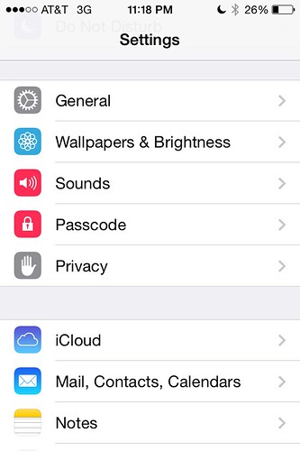
Here’s how you can customize your lock and home screens. After you've created the wallpaper you want to use, save it to Photos on your iPhone. Then, go to Settings, and scroll down to Wallpapers & Brightness.
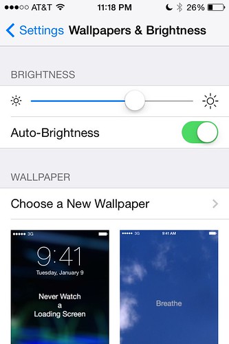
Tap on Wallpapers & Brightness, and it’ll call up a screen where you can see your current lock and home screens.
Tap on Choose a New Wallpaper, and you'll be taken to a Choose screen with Apple wallpapers, and your own photos. (If you already have a custom screen, it doesn't seem to show up as an option. Go figure.)
Go into Photos, and find the image you want to use. Unless you've saved it to a special album, it'll be in Camera Roll.
Tap on an image to select it. You’ll get a preview of what the screen will look like, and two buttons, Cancel and Set, at the bottom. if you're happy with the way it looks, hit Set.
Now, every time you pull out your phone, you’ll see a reminder, not just a pretty screen. Of course, nudges aren’t magic; they’re tools, and modest ones at that. But over time, they can help you shift your behavior.


